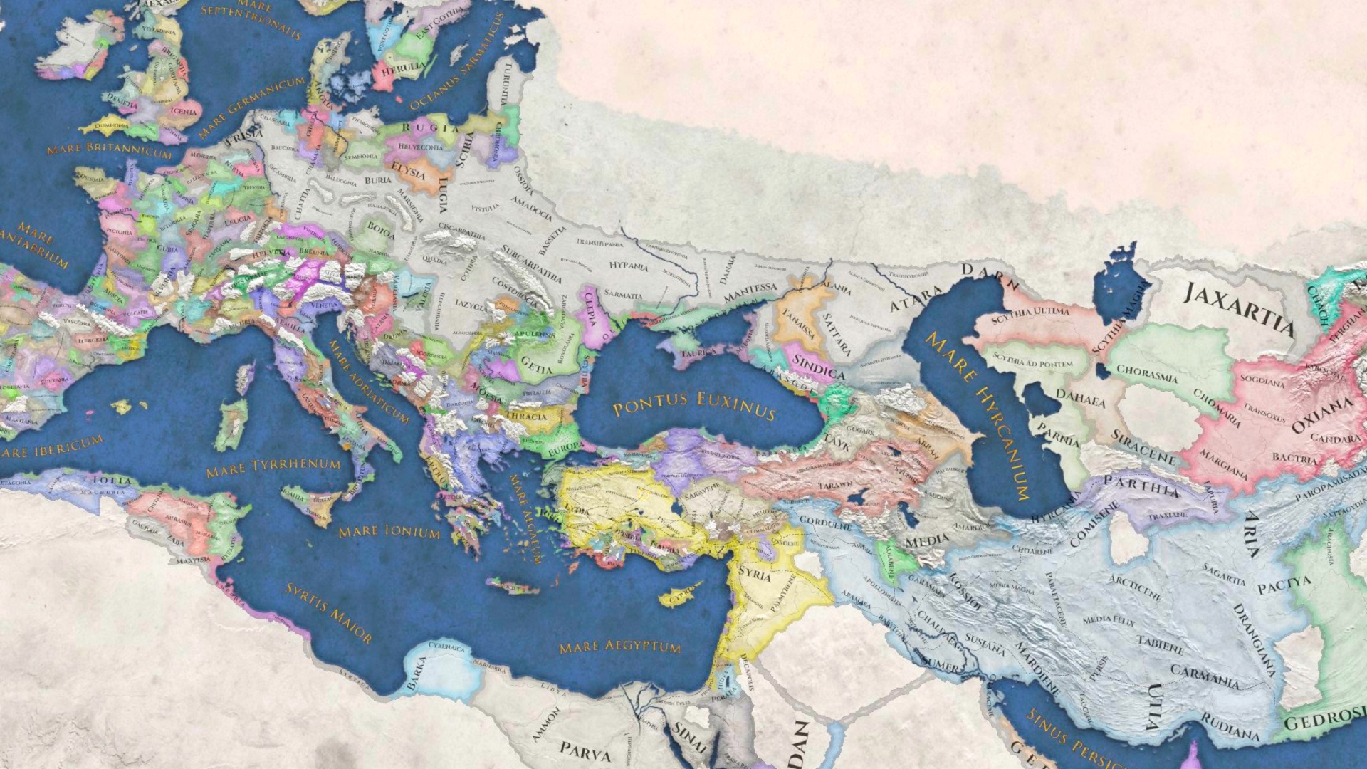
Imperator: Rome – Paradox Interactive’s recent attempt to bring its particular brand of map-painting grand strategy to the ancient world – has always been something of a chimera. Cobbled together with ideas and mechanics from the studio’s past titles, it was criticised at launch for failing to bring those separate parts together into a coherent whole.
The past year of patches and updates, however, has seen the historical strategy game pull itself together. Now, it’s biggest overhaul to date is poised to offer Imperator a fresh lease of life. Decisively moving away from many of the elements that made it feel like a toga-clad clone of EUIV, Imperator has instead embraced a more subtle approach towards managing your empire’s population.
The 2.0 ‘Marius’ patch continues this trend, and, in doing so, brings the game closer than ever to its goal of becoming a truly excellent ancients-themed grand strategy game. The update introduces a slew of big changes, the most obvious and immediate of which is the gorgeous new UI rework. New portrait backgrounds, tooltip changes, and a more stylised interface: it’s all very sleek.
RELATED LINKS: Imperator: Rome review, Imperator: Rome modding, The making of Imperator: Rome
0 Commentaires