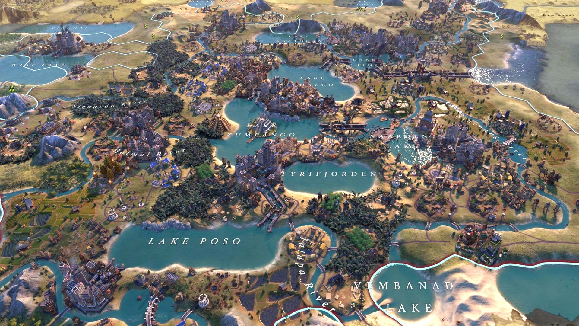
There were plenty of reasons why many preferred Civilization V to Civilization VI when the newer 4X game first released, and even though in recent years Civ 6 has come out the decisive leader of the two, one or two points of comparison will never go away. One of them being the art style.
Now, I don’t have issues with Civ 6’s art direction (and, ultimately, no one seems to care as much as the Age of Empires crowd does about AOE4), but it was certainly a departure from the muted realism of Civ 5. Fans have sometimes remarked that its art style is more 'cartoonish', which is a catch-all term often used for any style that’s bright or exaggerated. It's not something I often think about, but a recent find on the Civ subreddit reminded me how good the Civ 5 style can be if recreated today.
Other than showing a decent case of ‘canal porn’ (not as sensational as ‘tile yield’ porn, but just as impressive) involving six lakeside cities connected to the ocean via the Panama Canal wonder, it's a a gorgeous recreation of Civ 5’s graphics. This is because it uses the Environment Skin: Sid Meier's Civilization V mod, one of our favourite Civ 6 mods.
RELATED LINKS: The best Civ 6 mods, The best Civ 6 civs, Play Civilization VI
0 Commentaires